How to Analyse Trends In SolarWinds
SolarWinds® Orion is a magnificent tool for troubleshooting performance issues in your network, however when it comes to analysing future capacity or trends, even though it has some good insights, it doesn’t give you the fully comprehensive view that we would like to get, at least the way it is configured out of the box.
Nonetheless, SolarWinds stores historical data for each of the metrics that we monitor for analysis and forecasting purposes, as well as the option to use SQL or SWQ queries directly against the database. Hence it shouldn’t be too difficult to create trends and analyse data if we have a little bit of knowledge in SQL (or SWQL).
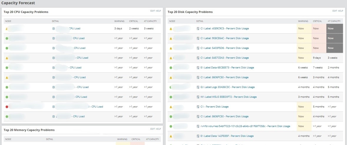
I’m not saying that SolarWinds Orion doesn’t have any way to get capacity forecast data if you don’t create custom dashboards using SQL queries. Actually, there are some nice resources available out of the box that will give you valuable capacity forecast data and tell you when your devices will run out of CPU capacity, memory, disk or interface bandwidth.
Let’s get the data
To extract the data from the SolarWinds database, the first thing we need to do is to find the tables that contain the data we want. SolarWinds database is quite intuitive in this matter, and the name of the tables from SQL or SWQL are clear enough to help us to locate the data we need. However, due to the quantity and inherent complexity of the database, there are some content structures which are more difficult to find.
As an example, the following table contains some of the most common metrics that we monitor from our network devices and the SWQL tables where you can find this data:
| Metric | SWQL Entity (Table) |
| Node Availability | Orion.responsetime |
| Response time | Orion.responsetime |
| CPU load | Orion.cpuload |
| Memory usage | Orion.cpuload |
| Interface availability | Orion.npm.interfaceavailability |
| Interface traffic | Orion.npm.interfacetraffic |
| Disk space | Orion.volumeusagehistory |
| Custom pollers | Orion.npm.custompollerstatistics |
| ASA Connections | Orion.ASA.ConnectionStatistics |
| F5 Connections | Orion.F5.LTM.VirtualServerstats |
Let’s test this with a couple of examples that have had really good feedback when we have configured them for our customers as part of our professional services. The first example displays a chart with the CPU time consumed per hour for the last 30 days (or another time period); and the second example displays the amount of time WAN interfaces are over a specific threshold (in the example, over 75% utilization).
CPU Time
Question: over the last few months, are the devices on your network consuming more CPU or less CPU time than their normal baseline behaviour?
I guess that your first thought would be they use more CPU, because we always think that this is the case, but is it true? How can we answer this question?
Actually, if I tell you that your servers are consuming 1000 min of CPU time per hour currently, you wouldn’t be able to answer me if this is a high or a small number, because, as with lots of other types of metrics, you need something to compare these values with, a baseline to tell you what is normal and what is not. Therefore the real question here is how we can create a baseline and calculate the trend of CPU time used in our network.
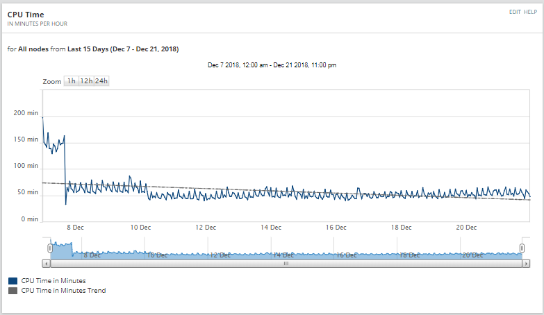
The following resource sums the CPU time consumed each hour by all the devices monitored in SolarWinds, and displays it in a chart. As we are displaying hourly data, the time frame has to be equal or lower than the hourly retention period (by default 30 days, but we recommend to extend it to 62 days, two full months).
On this example we see that the trend is going down, therefore we are using less CPU time than before, which makes sense, as this chart was generated during Christmas time, where there are more people on holidays and the servers are not as busy as usual.
We can also create some variants of these resource displaying last 12 months (we should group data daily instead of hourly) or display CPU time from critical devices only (using custom properties or name conventions).
If you want to configure this resource in your SolarWinds platform, please follow these steps:
- Go to a summary view
- Add new widget custom chart
- Change the Datasource at the top to Advanced Database Query, and then set the query type to SWQL
- Add the following SWQL Query to the white text field
[code]Select DATETRUNC('hour',datetime) as [Date],
round(sum((avgload * weight)/6000),2) as [CPU Time],
'in Minutes' as [Minutes]
from orion.CPULoad
where datetime >= ${FromTime} and datetime < ${ToTime}
and weight <= 3600
group by  DATETRUNC('hour',datetime)[/code]
- Time period: choose anything equal to or lower than the hourly retention period, for example, Last 30 days
- Data Series: CPU Time
- More -> Time Column -> Date
- Calculated series: Show Trend
- Units Displayed:
- Custom-> min
- Group chart data by: Minutes
- The legend shows: Minutes
- Sample Interval: Every hour
WAN Interface Time Over 75%
Question: are your WAN connections saturated?You might think that, as you have some alerts configured in SolarWinds that emails you when a WAN interface is saturated, that is enough. Further questions exist; are you really going to upgrade a circuit because, once, you received an email saying that the bandwidth utilisation of that link was high? Should you wait until this happens twice? Three-time? In a week? A month? The big issue here is alert analysis is only part of the trend analysis you need to be doing and that does not allow you to answer questions on the utilisation of a key metric such as this WAN connection example.
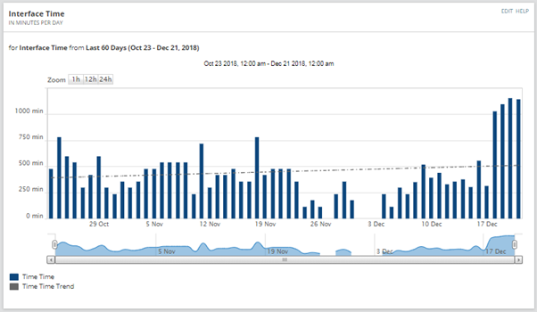
The following chart shows you the amount of time per day that WAN interfaces are over a specific threshold (75% in this example). In this case there is not a specific limit in terms of time frame for the chart, however the longer the retention periods are, the more accurate date this chart will display.
NOTE: in order to display WAN interface data, first of all, we need to find a way to identify the interfaces are connected to the WAN network and which ones are not. There are several ways to accomplish this in SolarWinds, however, we would always recommend the use of custom properties. For this chart, we are using a custom property called WANInterface, type Boolean, that defines normal interfaces (WANInterface = false) from WAN interfaces (WANInterface = true).
Based on this chart, it is fair to say that the last few days we had a little bit more of traffic (buying Christmas presents during working hours?), except for the last few days, the trend does not show any increase on WAN traffic. Therefore in this situation, I wouldn’t recommend upgrading your WAN links and I would want to correlate this to further event and Netflow analysis to understand what was generating more traffic during these 4 days.
If you want to configure this resource in your SolarWinds platform, please follow these steps:
- Go to a summary view
- Add new widget custom chart
- Change the Datasource at the top to Advanced Database Query, and then set the query type to SWQL
- Add the following SWQL Query to the white text field
[code]Select sum(it.weight)/60 as [Time],
datetrunc(‘day’,it.datetime) as [Date],
‘Time’ as label
from orion.npm.InterfaceTraffic it
where (it.inpercentutil >75 or it.outpercentutil > 75)
and it.datetime >= ${FromTime} and it.datetime < ${ToTime}
and it.interface.customproperties.WANInterface = 1
group by datetrunc(‘day’,it.datetime)[/code]
- Time period: choose anything equal to or lower than the hourly retention period, for example, Last 60 days
- Data Series: Time
- More -> Time Column -> Date
- Calculated series: Show Trend
- Units Displayed:
- Custom-> min
- Line: Stacked Column
- Group chart data by: Label
- Legend shows: Label
- Sample Interval: Every day
Other Trends
The charts we have created for CPU or interface traffic can be replicated for any of the metrics available in SolarWinds such as disk utilization, firewall connections, VPN connections, availability, etc. Just think about which metric you would like to forecast. I hope this article has been informative for you and thank you for your time reading it.
Training Course: SolarWinds Training Courses

Raul Gonzalez
Technical Manager
Raul Gonzalez is the Technical Manager at Prosperon Networks. As a Senior SolarWinds and NetBrain Engineer for over seven years, Raul has helped hundreds of customers meet their IT monitoring needs with SolarWinds and NetBrain Solutions.
Training Course: SolarWinds Training Courses
Related Insights From The Prosperon Blog
Don’t get lost! Mapping your Network with SolarWinds
Heard of SolarWinds Intelligent Maps and never known where to start with them? You’re in luck! Join us as we chart a course……sorry I couldn’t resist! Let’s navigate through...
The Critical Role Of The Trusted Advisor In NetOps
Before there was “Network Operations” there were networks. Networks grew out of a need for connecting one box to another, sharing printers, and for more advanced users,...
Webinar On-Demand: Beyond Monitoring – Introducing SolarWinds Observability Platform
In this webinar, you will discover how SolarWinds® is evolving to deliver complete infrastructure visibility. This webinar examines how to extend visibility across your IT...


